#1 - Wainscot Only

#2 - Elevator Tower

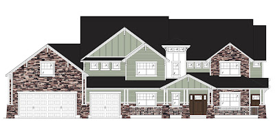
#3 - Elevator Tower and Over Garage

#4 - Elevator Tower, Over Garage, Jonah's Room

#5 - Elevator Tower, Over Garage, Jonah's bedroom white

#6 - Door and Single Garage

#7 - Door, Single Garage, and Over Double Garage

#8 - Two Bedrooms

#9 - Two Bedrooms and Over Garage

#10 - Two Bedrooms and Full Garage

#11 - Nursery and Single Garage
#12 - Nursery, Single Garage, and Over Double Garage

#13 - Nursery and full Double Garage
PS - There has been general public outcry against the white sections. This house was our inspiration, but their white tower is mostly windows, so maybe the execution isn't quite the same:

And here's a real life example of stone, Hardie Board siding, and a white pop-out we found in Centerville:

17 comments:
Rock'n Choices: I think the best looking is 10, followed by 8, 4, and 1. If I had to do the work, I would be voting for 1. -- Dad A.
I vote for #1, but make the elevator green like the rest of the house.
1 for simplicity, then 10 or 13 if you want to rock a little more. I want a balanced look. Also agree that the elevator tower should be same as the rest of the house.
Kevin
my favorite shown is #3.
Doug, Hilary, and Aaron all dislike the whole garage in stone. And we don't like white anywhere.
Hilary likes the stone up above the garage doors but not all the way to the top. I also like the stone tower.
I wonder what it would look like with the stone all the way along the first floor plus the top of the elevator tower? A lot like #3 just add stone around the window to the right.
I also wonder about #3 minus the stone around the downstairs window to the right of the tower.
I really like the idea of the tower in stone.
Just to round things out, I like 12,7, and 1. I like the white on either the tower or the bedroom.
This is a great game. Here’s my analysis. Important considerations:
1. The tower should stand out from the Jonah gable.
2. Stone should balance left to right.
3. Garage shouldn’t say “I’m huge.”
Sketch #2 works pretty well for this, except that the garage looks too big. Number #3 works much better for the garage. With #3, you need to add stone around the living room window to stay in balance left to right. This might be my favorite option.
The stronger, but slightly flawed candidate for my favorite is #9. The Jonah and nursery gables get some extra zing from the stone, and the tower wants to sing its own song. It has a different roof. Why should it have the same sheathing? I love the concept. However, in the drawing, the white on the tower looks too stark. It works on the inspiring house because that tower has very little wall, and each piece is slightly slimmer than the porch pillars below. That tower is just a few porch pillars and windows excited to have risen to the next level. It’s different in a way that’s well connected. In your sketches, the white tower doesn’t have enough to anchor it to the rest of the house. Are there other design elements you can use to connect it? If the trim and garage doors are white, it might look better and more unified in reality than it does in the sketches. But you certainly don’t want it to look different in a cheap, unfinished, or tacked-on way. Maybe #3 with the extra stone by the living room would be best. Let the tower rise proudly in stone.
NUMBER 3 AND NUMBER 4 ARE THE BEST, BUT I'D GO WITH THE LESS EXPENSIVE OF THE TWO BECAUSE I'M CHEAP LIKE THAT--DIRK
rock configuration #3, 4
Larissa and Kay vote for #3. Too much rock too high gets heavy and the house looks like it should tip over. This one has it about right.
I like #4 and #10. I really like the look of the rock. Jenny
Beth likes #4, then # 9, then 10.
I like number 3,10,4
it is sooo cool --lydia
I love number 10 the very most!
I like #1 #3 #9 the best. Sometimes less is more. But it's your house and your the one that gets to pay for it and do the work. So really it boils down to how much you want to pay for and do. This is the first time I've looked on the blog. The house looks very nice so far. Maybe we can stop and look at it when were down for turkey dinner.
I think I l,ike #3 the best. A little rock to establish a foundation , with the contrasting hardy board. A little more rock wouldn't hurt, but I feel if you get too much, it would overpower the rest of the design.
I think I l,ike #3 the best. A little rock to establish a foundation , with the contrasting hardy board. A little more rock wouldn't hurt, but I feel if you get too much, it would overpower the rest of the design.
Post a Comment